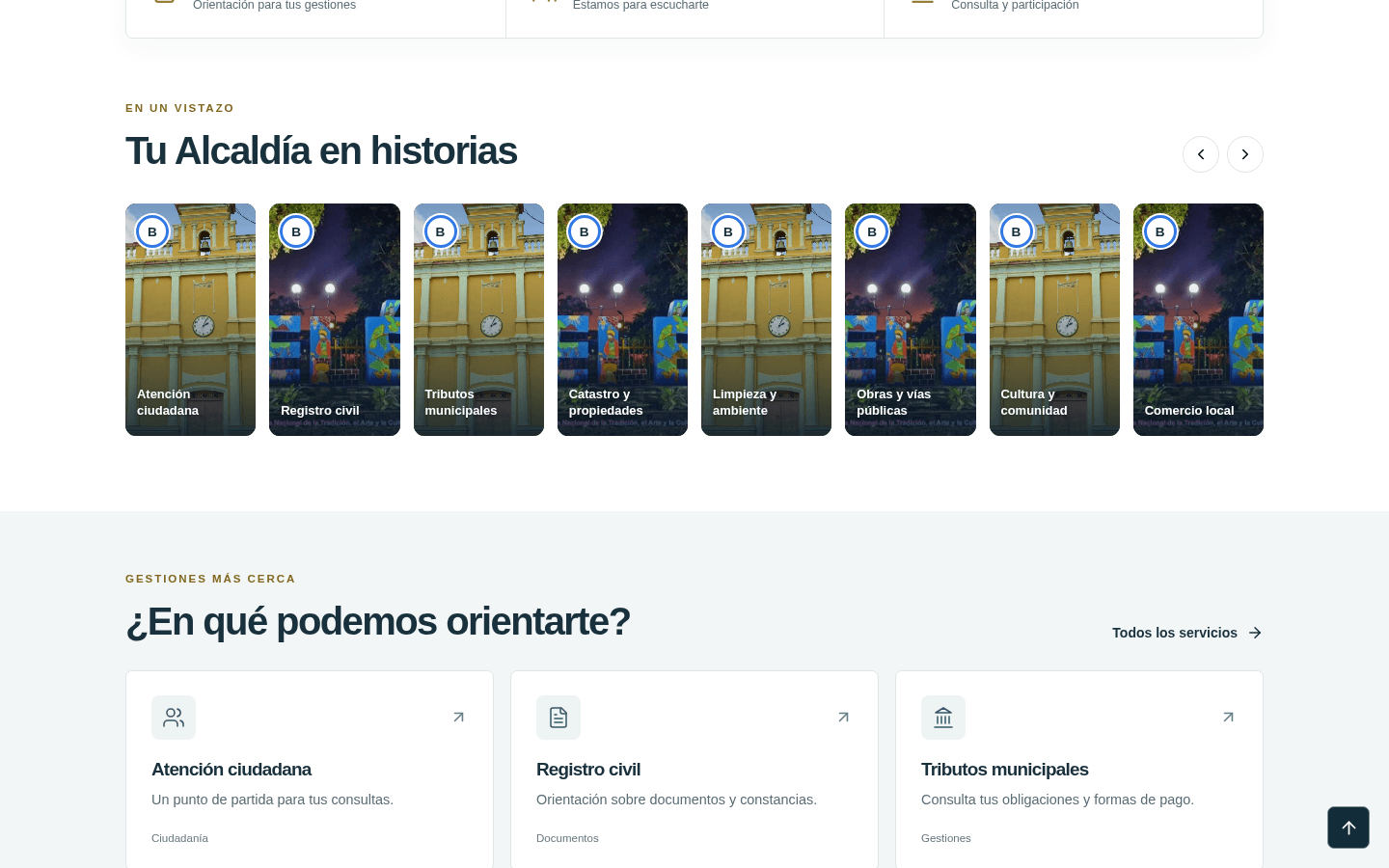
Use the visitor’s vocabulary
People usually arrive with a question, not with a knowledge of an organization’s internal departments. Navigation labels should help them recognize their destination. A municipal portal, for example, can group information around services and procedures rather than expecting residents to know which office is responsible for each task.
Make the next step visible
A page should make it clear whether a visitor can complete an action online, needs to contact someone or should visit an office. A demonstration must also identify its limits. Clear wording avoids turning an attractive interface into a promise that the underlying service cannot fulfil.
Review the whole journey
Readable text and consistent controls are part of the work, but the complete journey matters too. Can someone find the service from the home page? Does the detail page answer the likely questions? Does the contact link lead to the right place? Reviewing these steps together helps reveal problems that a single screenshot cannot show.